Enter password to view project
Amazon SageMaker Unified Studio: Administration Portal
Allowing adminstrators enterprise control over their company's product usage.
Role
Lead UX Designer
Industry
Data Analytics
Duration
3 months
Problem and Background
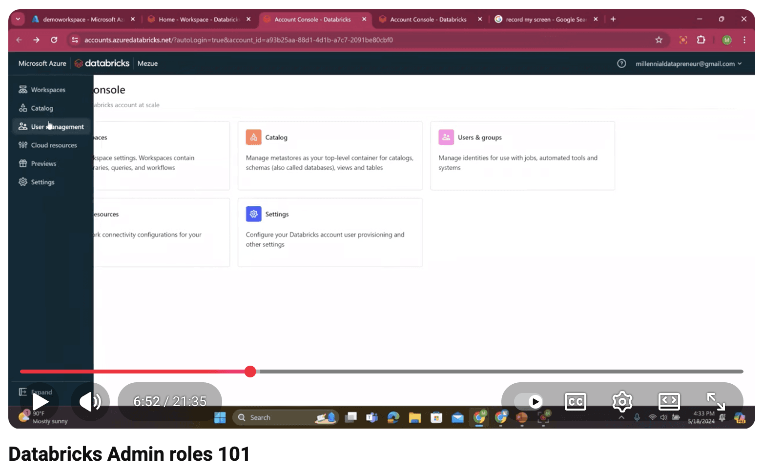
We recognized a major usability gap: admins had to manage tasks across two different environments: the AWS console and our product’s standalone web portal. Some admin features existed in one place, some in the other, and users had trouble knowing where to go for what. This fragmentation increased setup time, created confusion during onboarding, and led to frequent support questions about where specific admin actions lived.
To deliver a more seamless experience, we set out to centralize admin actions within the product itself, eliminating unnecessary context-switching and improving clarity for both admins and regular users.
Wireframing
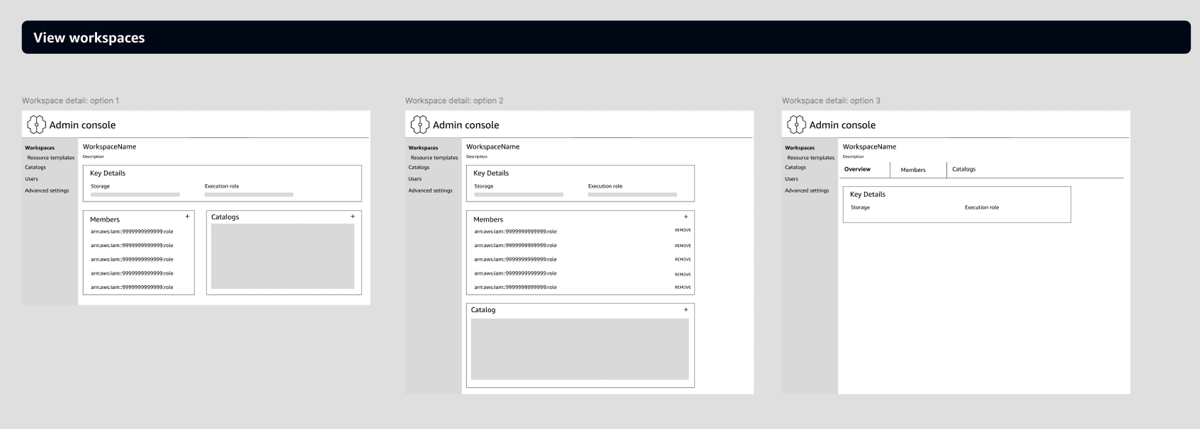
I began by exploring several early concepts to define the foundational structure of the admin experience. These initial wireframes helped validate the core navigation model, clarify what needed to be centralized, and identify gaps in the existing workflow before investing in higher fidelity. Through this process, I defined a tab-based structure that separated major user stories into distinct, focused sections.
High-Fidelity Iteration
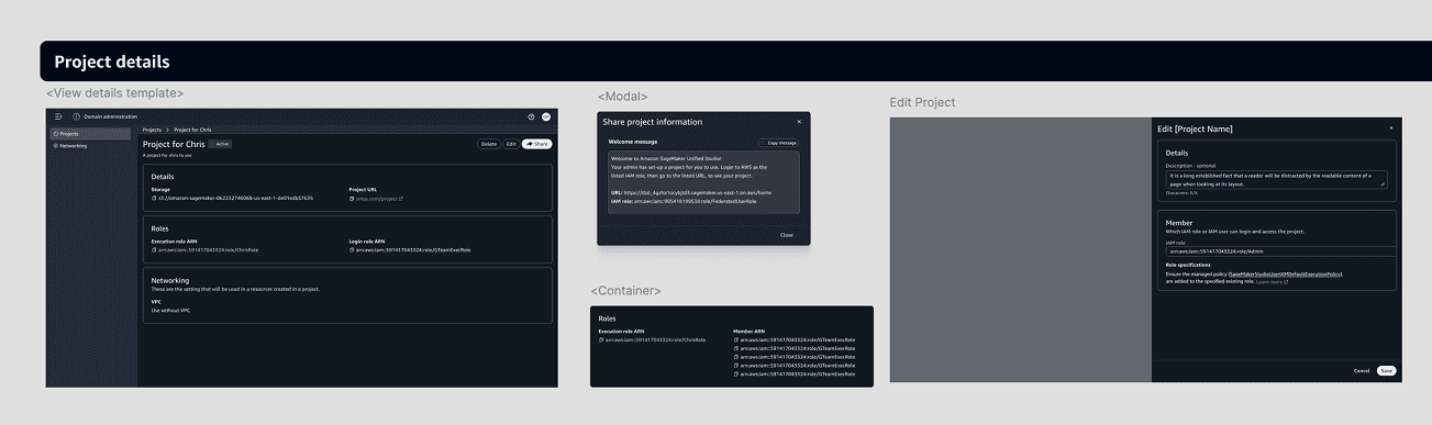
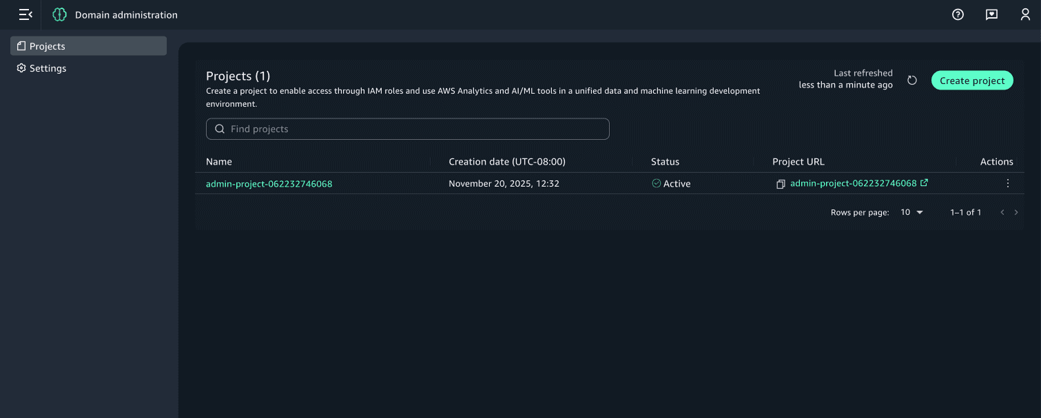
I moved into high-fidelity designs. I went through multiple rounds of feedback, incorporating evolving requirements, shifting priorities, and several scope adjustments. Each iteration helped refine the requirements, simplify the workflows, and ensure the experience aligned with both user needs and technical constraints. Based on these learnings, I eliminated a traditional home screen and instead put the projects list, the most critical user action, front and center.
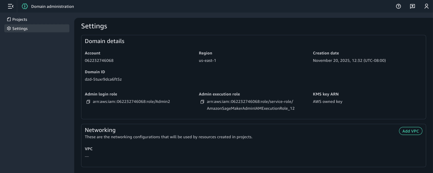
Final designs, Launch and Outcomes
The updated admin experience went live in December 2025. Adoption was strong from the start: more than 40% of new users opted into the new admin portal, confirming the need for a centralized and streamlined admin workflow.
Other projects

Amazon SageMaker Unified Studio: Quick Setup
Simplifying on-boarding to improve user uptake

Amazon DataZone: Access Control
Fine-grained data permissioning to let publishers securely share partial datasets without creating redundant assets.

ART19: Inventory Management & Forecasting
A forecasting and availability system to surface real-time ad inventory opportunities within a complex dynamic insertion model.